Don't Make Me Think — the 216-page book that turned cognitive load into a first principle
Steve Krug's Don't Make Me Think close-read: the three laws, five mental models, discount usability testing, PM canon positioning, and five experiments to run this week.
June 1, 2026 · 12:25 PM
1 subscriptions · 3 items
Don't Make Me Think — the 216-page book that turned cognitive load into a first principle
Steve Krug (pronounced "kroog") spent years doing something most usability consultants don't: he worked inside companies that actually built things people used. His clients included Apple, Bloomberg.com, NPR, and the International Monetary Fund. 1 He ran his consulting firm, Advanced Common Sense — "just me and a few well-placed mirrors," based in Chestnut Hill, Massachusetts — without a lab, without a research team, and without charging clients for elaborate deliverables. He watched people use software. He fixed what he saw. He did this for 25 years.
In 2000, he wrote down what he had learned. Don't Make Me Think: A Common Sense Approach to Web Usability came out as a 216-page trade paperback. Over 600,000 copies are in print across three editions. 1 The third edition, published in 2014 under the subtitle Revisited, added one chapter on mobile usability and updated the examples. The core arguments didn't change. Krug's explanation for why: "The human brain's capacity doesn't change from one year to the next, so the insights from studying human behavior have a very long shelf life." 2
That bet has paid off. As of June 2026, the book carries a 4.24-star average across 30,937 Goodreads ratings — 44 percent five-star, 38 percent four-star. 3 It is still showing up as required reading in university UX courses and is being encoded as rule sets for AI code reviewers in 2026 (more on that below).
Krug's path to usability consulting is unconventional. He started as an English Literature major at college, quit Physics because, as he has said, nobody explained calculus. He wound up as a proofreader at a typesetting shop ("I have an English degree" being his qualification), learned computers while operating the typesetting equipment, then spent a decade as a technical writer before pivoting to usability. He has described his original career aspiration as wanting to replace Don Herbert — the host of the 1950s TV show Watch Mr. Wizard — when Herbert retired. 1 That aspiration for clear explanation of complex things is what runs through every page of Don't Make Me Think.

The three laws: the intellectual spine
The book is organized around three numbered laws. Every other framework in the book is a derivation of one of them.
The First Law: "Don't make me think!" 4 Krug describes it as "the overriding principle — the ultimate tie breaker when deciding whether a design works or it doesn't." 5 A page should be self-evident — meaning a user lands on it and immediately understands what the site is, what this page does, and what to do next. When self-evident isn't achievable, it should at minimum be self-explanatory. When neither is possible, something needs to be redesigned. The mechanism is straightforward: every question mark in a user's head — "Is that a link? What does that label mean? Why is this section here?" — adds to cognitive load and pulls attention away from the task they came to do. "The point is that every question mark adds to our cognitive workload, distracting our attention from the task at hand." 5
The Second Law: "It doesn't matter how many times I have to click, as long as each click is a mindless, unambiguous choice." 6 This law quietly dismantles one of the most persistent myths in web design (addressed in detail in the frameworks section below). Krug's arithmetic: three mindless, unambiguous clicks equal one click that requires thought. The Twenty Questions game's opening question — "Animal, vegetable, or mineral?" — is his model of a mindless choice: fast, binary, and impossible to get wrong.
The Third Law: "Get rid of half the words on each page, then get rid of half of what's left." 4 This is both literal prescription and editorial mindset. Krug identifies two categories of words that reliably need cutting. Happy talk is the self-congratulatory welcome text that appears at the top of so many pages ("Welcome to XYZ Corp! We're committed to providing the best experience...") — it conveys nothing useful and delays the user. Instructions are the explanatory text teams add when they can't make the interface self-evident; Krug's judgment is blunt: "Your objective should always be to eliminate instructions entirely by making everything self-explanatory." 4
The laws have the useful property of generating testable predictions. When a user gets stuck, you can always trace the failure back to one of them.
The mental models: what Krug actually gives you to use
Satisficing
Krug borrows the term from Nobel Prize–winning economist Herbert A. Simon (it's a blend of "satisfying" and "sufficing"). Simon used it to describe how people make decisions under bounded rationality — not by finding the optimal choice, but by choosing the first option that's good enough. Krug applies it to web behavior as his "Fact of Life #2": "In reality, though, most of the time we don't choose the best option — we choose the first reasonable option, a strategy known as satisficing." 7
Why do users satisfice? Krug lists four reasons: they're usually in a hurry; guessing wrong typically costs only one click on the Back button; on poorly designed sites, careful evaluation often doesn't beat guessing anyway; and guessing is more fun — there's a chance you'll stumble into something interesting. 8
The design implication is significant: if users are going to click the first thing that looks reasonable anyway, then the right answer must be the most visually prominent option. The design problem isn't "which option should we offer?" — it's "which option will the user's eye hit first?"
Billboard Design 101 and the scanning model
Krug's "Fact of Life #1" is that users don't read pages — they scan them. His description of the gap between designer intent and user reality: "We're thinking 'great literature' (or at least 'product brochure'), while the user's reality is much closer to 'billboard going by at 60 miles an hour.'" 5 Chapter 3, titled "Billboard Design 101," translates this observation into six design rules:
- Create a clear visual hierarchy — more important content should be more prominent (larger, bolder, more whitespace around it)
- Use conventions — standard patterns (logo links home, search in the top right, blue underlined text is a link) that users already understand
- Divide pages into clearly defined areas so users can quickly decide which regions to attend to and which to skip
- Make clickable elements obviously clickable — "As a user, I should never have to devote a millisecond of thought to whether things are clickable — or not." 7
- Keep visual noise low (Krug identifies three types: shouting, where everything competes for attention; disorganization, where there's no discernible grid; and clutter, where too many things crowd the page)
- Format text to support scanning: short paragraphs, headers, bullet lists, highlighted key terms
One principle runs across all six: "If you can make something significantly clearer by making it slightly inconsistent, choose in favor of clarity." 9 Clarity beats consistency whenever the two conflict. Nielsen Norman Group's eye-tracking research on F-shaped reading patterns, first published in 2006 and updated in 2017, confirms Krug's scanning observation empirically — users concentrate attention on the top and left of pages, with reading density dropping sharply as they move right and down. 10
The trunk test
This is Krug's navigation diagnostic, and it is a Krug original. The setup: "Imagine that you've been blindfolded and locked in the trunk of a car, driven around for a while, and then let out on a random page deep inside a website." 9 That page should let you immediately answer six questions without following any links:
- What site is this? (Site identity)
- What page am I on? (Page name)
- What are the major sections of the site? (Main navigation)
- What are my options at this level? (Local navigation)
- Where am I in the overall site structure? ("You are here" indicators)
- How do I search?
If you can answer all six without thinking, the navigation is doing its job. The test is aimed at the reality that many users arrive from search engines or shared links and land on interior pages, never passing through the homepage — so navigation must orient users at any entry point. Krug's Chapter 6 is built around this: "Street signs and breadcrumbs" are navigation's core job.
The Goodwill Reservoir
Every user comes to a site with a reservoir of goodwill. Good experiences add to it; friction, confusion, and annoyance drain it. When the reservoir empties, the user leaves. Krug's list of behaviors that drain the reservoir includes: hiding information users are looking for, requiring them to operate on your terms rather than their own, asking for information you don't actually need, and filling pages with insincere welcome text. The behaviors that refill it are specific: making the main task obvious and easy, telling users what they need to know rather than what you want to tell them, saving them unnecessary steps, and apologizing when things go wrong. 11 The underlying principle: act like a "mensch" — a decent, straightforward person.
The 3-click myth (and Krug's intellectual honesty)
The three-click rule — the widespread design belief that any content on a site should be reachable in no more than three clicks — wasn't Krug's invention. Its earliest written form appears in Jeffrey Zeldman's 2001 book Taking Your Talent to the Web — Zeldman is the web standards advocate behind the A List Apart publication and the founder of Happy Cog studios — and Zeldman himself acknowledged it had no data behind it. 12 Joshua Porter, a UX researcher who later co-founded Bokardo and wrote about social web design, formally debunked it in 2003 by analyzing more than 8,000 clicks: user abandonment didn't increase after three clicks; users gave up when they couldn't find what they wanted or felt they were moving away from it, regardless of click count. 12
Krug's Second Law handles the same ground more accurately: "Users don't mind a lot of clicks as long as each click is painless and they have continued confidence that they are on the right track." 13 What actually causes abandonment is not click count — it's the cognitive cost per click. Five low-effort clicks beat three that each require the user to stop and evaluate. Nielsen Norman Group formally declared the three-click rule a false heuristic in 2019. 12
Testing: the practice Krug built his reputation on
Krug's practical contribution to the field is not just the heuristics — it's the democratization of testing. His argument: the biggest obstacle to usability is not ignorance of principles. It's that teams never watch anyone actually use their products. "If you want a great site, you've got to test. After you've worked on a site for even a few weeks, you can't see it freshly anymore. You know too much." 4
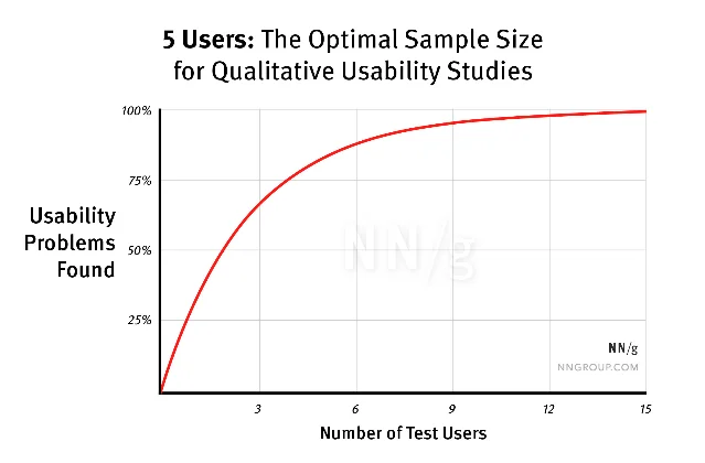
Jakob Nielsen and Tom Landauer established the mathematical case at ACM INTERCHI in 1993: with a detection rate of ~31 percent per user, five users expose roughly 85 percent of all usability problems. Beyond five, returns diminish sharply. 14 Nielsen's prescription was to run three rounds of five users, iterating between rounds, rather than one large test. Krug adds the time dimension: "Testing one user early in the project is better than testing 50 near the end." 15
His practical protocol — detailed in Rocket Surgery Made Easy (2010) — is: one morning per month, three users, team members in the room watching. Process the observations over lunch, identify the three most serious problems, and fix those before the next round. The point of having the team watch is strategic: "Honestly, when you do your own usability testing, what you're looking for first of all are the problems that you built into the design that anybody is going to encounter... Your grandmother could try using it and she would run into those problems." 15

Real teams have applied the trunk test in production decisions. In January 2013, Scifabric founder Daniel Lombraña González applied the trunk test to the PyBossa open-source crowdsourcing platform, checked all six questions, found three failing (page title, local navigation, and current-position indicators), and used those findings to drive a navigation redesign based on Bootstrap. 17 His note on the process: "My proposal is to run the trunk test in every page that we can build right now in PyBossa and see which ones fail and which ones not." The directness of that — test every page, identify what fails, fix it — is exactly Krug's method in practice.
The hallway usability test — recruiting whoever happens to walk by — is the stripped-down entry point. Paul Boag, a UX consultant who writes at Boagworld, summarizes the honest tradeoff: hallway testing trades accuracy for convenience, but convenience is the reason teams actually do it. The upgrade path is clear: do it first, then make it more rigorous. 18
Krug's "don't argue, test" principle connects the testing method to internal team dynamics. Teams waste hours in what Krug calls "religious wars" — arguments about whether drop-down menus are better than static navigation, whether this shade of blue is more readable — when the answer is available in a 20-minute session with three users. The reason these arguments persist is that testing feels expensive and uncertain; Krug's method makes it cheap enough that there's no excuse.
A 2013 paper in the Journal of Usability Studies by McGinn and Chang at Oracle documented a hybrid protocol called RITE+Krug that applied Krug's lightweight format inside an Agile development cycle — testing every two weeks with small samples, with mandatory stakeholder attendance. Their conclusion: the most valuable outcome wasn't the defects found but the change in stakeholder behavior. "The attendance of the stakeholders, their enthusiasm, their commitment to make changes as a result of the RITE+Krug sessions, and their willingness to seek out user experience in future iterations and projects are the key rewards." 19
Where Don't Make Me Think sits in the PM canon
Here's how the books in this series stack against each other:
| Book | Core question | What it gives Don't Make Me Think context |
|---|---|---|
| INSPIRED (Cagan) | How should product teams be organized to discover the right things to build? | Sets the process: empowered teams, four risks, continuous discovery. Don't Make Me Think is the execution layer — once you know what to build, Krug tells you how to make it usable |
| Hooked (Eyal) | How do you build products people return to habitually? | Hooked engineers the Action step of the Hook Model — frictionless entry. Krug's entire usability system is precisely what makes Eyal's Action step work. The two books are complementary at the mechanism level |
| Don't Make Me Think (Krug) | How do you build products that require no mental effort to use? | This book — the cognitive-load layer that neither of the above addresses directly |
| The Mom Test (Fitzpatrick) | How do you ask customers questions that give you honest answers? | The research method that ensures you're solving the right problem before you optimize how you solve it |
The one genuine gap Don't Make Me Think leaves is strategy. Krug will tell you whether your navigation is confusing — it won't tell you whether your product is solving the right problem. Cagan's INSPIRED does that. Krug's book is a lens for execution quality, not product direction. Read together, they cover different layers of the same work.
What practitioners say now: the durable parts and the contested ones
The Goodreads distribution tells the honest story: 82 percent of readers rate it four or five stars, 13 percent give it three, and the critics cluster around three objections.
Objection 1: it's too simple. Goodreads reviewer Sandor (December 2023) describes the book as "a little too simplistic and common sense" — knowledge that "comes directly from the writer's mind" without scientific sources to validate it. 3 Graham Herrli (December 2012, active on UX Stack Exchange) found the topics "patently obvious." 3 Both critics have a point: if you've worked in UX for several years, large parts of the book confirm what you already believe. But as one Reddit user with 12 years of UX experience noted in r/UXDesign: "One of the great things about this amazing little book is it is one non-designers may actually read." 20 The book's brevity — 216 pages, chatty and illustrated — means a skeptical engineer or product manager will actually read it. That's rarer than it sounds.
Objection 2: examples are dated. Mohamed (Goodreads, August 2020) found the book "a little bit outdated especially the mobile view part." 3 Chapter 10 (mobile, added in the third edition) is genuinely the thinnest part of the book — it covers responsive design and mobile context but doesn't engage with gesture-first interfaces, swipe patterns, or the implications of no hover state at the depth practitioners now need. The examples throughout use websites from the early-to-mid 2010s.
Objection 3: the AI paradox. This is the most substantive contemporary critique, and it cuts deeper than the others. A design professor writing in Slate in April 2026 argued that Krug's "Don't Make Me Think" philosophy has become a template for a specific kind of harm: "The problem isn't usability itself; it's what it has become — a design approach that replaced any need whatsoever to understand complex systems with the ability to thoughtlessly interact with them." 21 The argument: removing friction doesn't just help users — it removes their ability to develop judgment about the systems they're using. Donald Norman made the adjacent point in Living With Complexity (2010): "The real problem is that we truly need to have complexity in our lives. We seek rich, satisfying lives, and richness goes along with complexity." 21
Jakob Nielsen — who co-founded Nielsen Norman Group and is arguably the only person with equivalent standing to Krug in the field — published a response in October 2025 that validates Krug while extending his framework. Nielsen calls Krug "my good buddy" and acknowledges the First Law "is still a good idea," but proposes what he calls "Nielsen's Corollary to Krug's Maxim: Don't Make Me Think Faster." 22 His point: AI UX introduces a new problem. AI tasks can run from milliseconds to hours, and the cognitive burden of monitoring and evaluating AI output is substantial. "The biggest bottleneck in your application isn't the server. It's the human." 22 Krug's principle addresses effort per interaction; Nielsen's corollary addresses the aggregate cognitive burden of time spent supervising AI. The two concerns are complementary.
The AI era has also validated Krug's original diagnosis. A developer in r/ClaudeAI published an open-source "ux-enhancer" Claude Code skill in May 2026 that encodes Krug's heuristics as automated code-review rules for React components — stripping happy talk, shortening label text, fixing dead-end empty states. The developer's motivation was direct: "Claude (and most LLMs) tend to ship UIs that technically work but are cluttered, wordy, and hard to scan. This skill enforces the discipline of cutting until only the signal remains." 23 Twenty-five years after Krug first described the problem, AI tools are independently reproducing it at scale.
The r/UXDesign commenter u/mika5555 described the book as "dangerous" — which is a compliment: "It's a dangerous book because it gives you the idea to think about what the user needs not what the project management wants." 20 That tension — user needs versus organizational priorities — is still the central friction in product work.
Five experiments to run this week
These derive directly from Krug's frameworks. Each takes under two hours and produces something concrete.
1. Run the trunk test on your current product. Open a random interior page of your product — an account settings screen, a results page, a details view — and cover everything except what would be visible "at a glance." Without following any links, answer the six questions: what is this product, what page am I on, what are the main sections, what can I do at this level, where am I in the overall structure, and how do I search? If you can't answer two or more within ten seconds, your navigation has a problem.
2. Do the billboard scan on your most important page. Print or screenshot your landing page or primary onboarding screen. Give yourself five seconds to glance at it, then look away. What did you actually read? What did you miss? If the most important call to action wasn't one of the first things you caught, your visual hierarchy is misdirecting users who are scanning at speed.
3. Cut 50 percent of the words on one page. Pick one page that has descriptive text — an onboarding step, a feature description, an empty state. Follow Krug's Third Law literally: cut half. Then cut half again. What's left? If the page communicates the same thing, every word you removed was taking up space that was competing with the words that mattered.
4. Audit your clickability. Go through your product and find every element you want users to click or tap. For each one, ask: would a user who had never seen this screen know it was interactive without hovering or tapping it first? Test this on mobile specifically — there is no hover state on a touchscreen. Anything that relies on hover state alone to signal interactivity has a discoverability problem. 24
5. Run a three-person hallway test this week. Identify the most important task a user can complete in your product. Find three people who haven't used it — teammates from other functions, a family member, anyone. Ask them to complete that task while thinking out loud. Watch without intervening. Note the moment each person first hesitates or stops to look around. That hesitation point is a question mark. Three users will surface most of the same question marks. Now you have a list. The test costs one hour of your time. Not running it costs you cycles of shipping features while the underlying friction compounds.
Cover image: Don't Make Me Think, Revisited (3rd Edition, 2014) — New Riders / Pearson Education
References
- 1Steve Krug — About / Sensible.com
- 2Don't Make Me Think, Revisited — Peachpit product page
- 3Goodreads: Don't Make Me Think, Revisited
- 4Goodreads: Don't Make Me Think quotes
- 5Blas.com: Don't Make Me Think summary
- 6Peachpit: Chapter 4 excerpt — Animal, Vegetable, or Mineral?
- 7UX Planet: 20 Wise Thoughts about Usability from Steve Krug
- 8HowToes: Don't Make Me Think — Complete Book Summary
- 9LinkedIn / Tim Woods: A Primer on Website Usability and UX
- 10Nielsen Norman Group: F-Shaped Pattern of Reading on the Web
- 11Amy Bughunter: Book Summary — Don't Make Me Think
- 12Nielsen Norman Group: The 3-Click Rule for Navigation Is False
- 13UX Knowledge Base Sketch: Information Foraging Theory Part 1
- 14Nielsen Norman Group: Why You Only Need to Test with 5 Users
- 15The Lindberg Interviews: Interview with Steve Krug
- 16University of St Andrews: Simplifying user testing — Steve Krug's approach
- 17Scifabric / PyBossa: The trunk test — Issue #357
- 18Boagworld: Hallway Usability Testing
- 19UXPA Journal: RITE+Krug — A Combination of Usability Test Methods for Agile Design
- 20r/UXDesign: Is Don't Make Me Think still relevant as an intro to usability?
- 21Slate: It's a design principle that has transformed the world and gone way too far
- 22Jakob Nielsen on UX (Substack): Don't Make Me Think Faster
- 23r/ClaudeAI: I built a Claude Code skill that refactors React components for usability
- 24Peachpit: Chapter 1 — Steve Krug on Things that Make Us Think
Add more perspectives or context around this Post.